

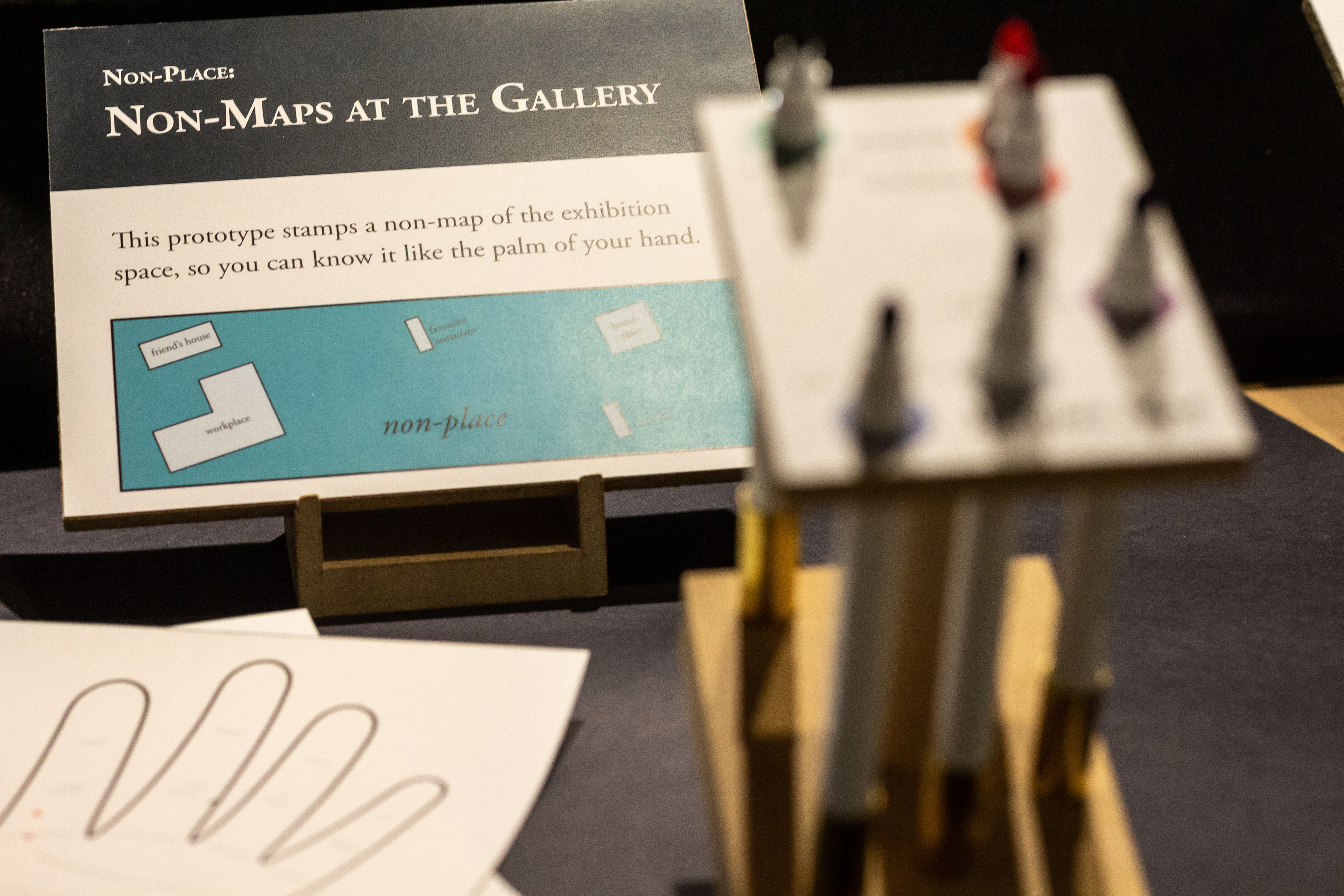
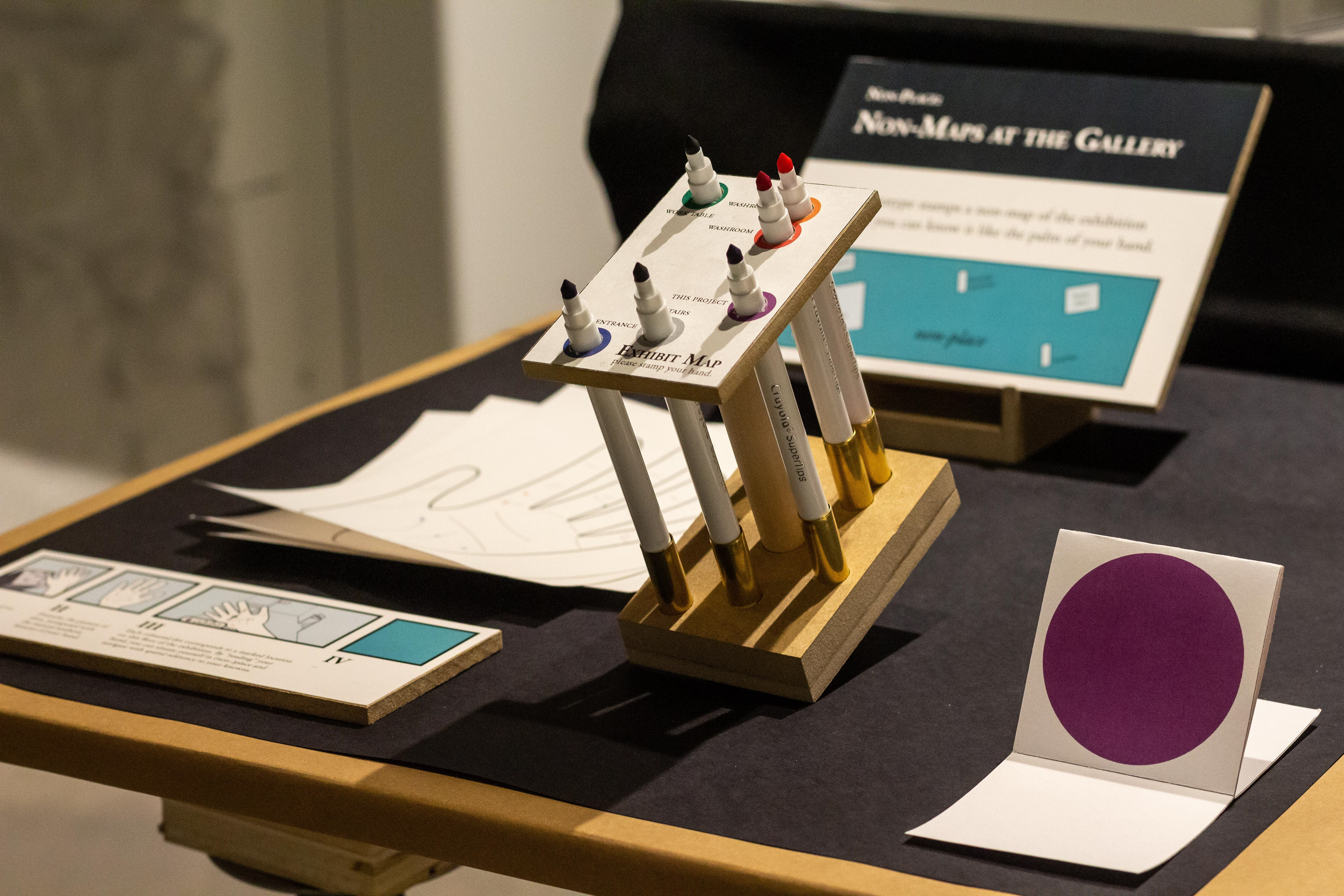
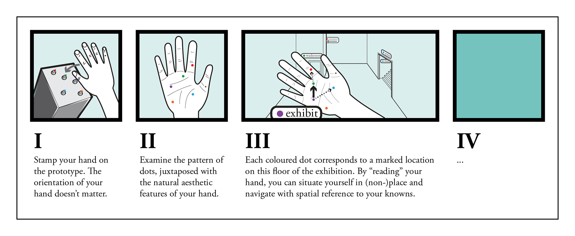
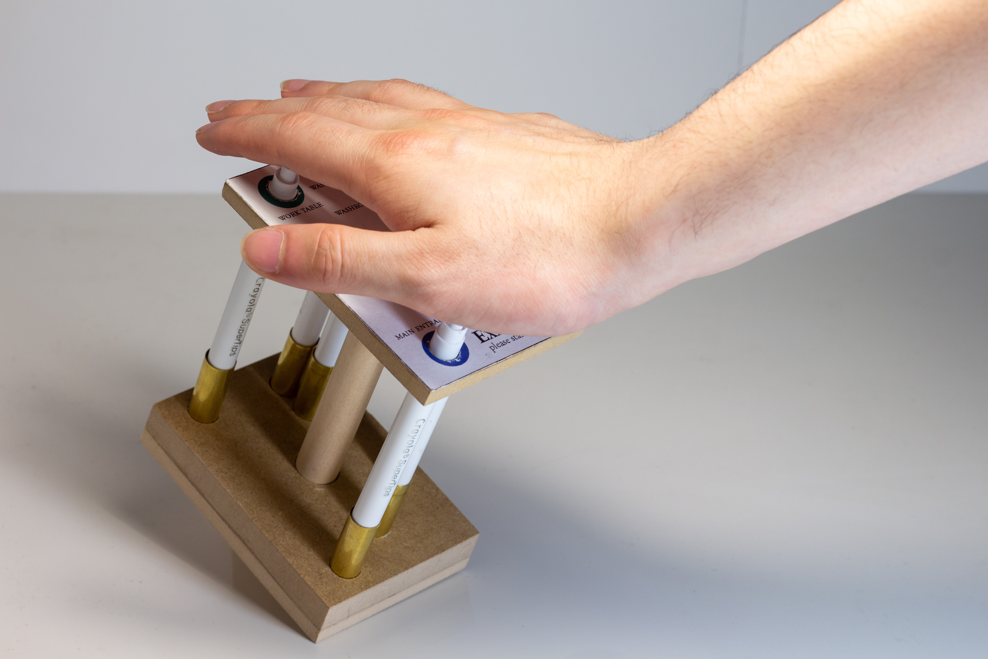
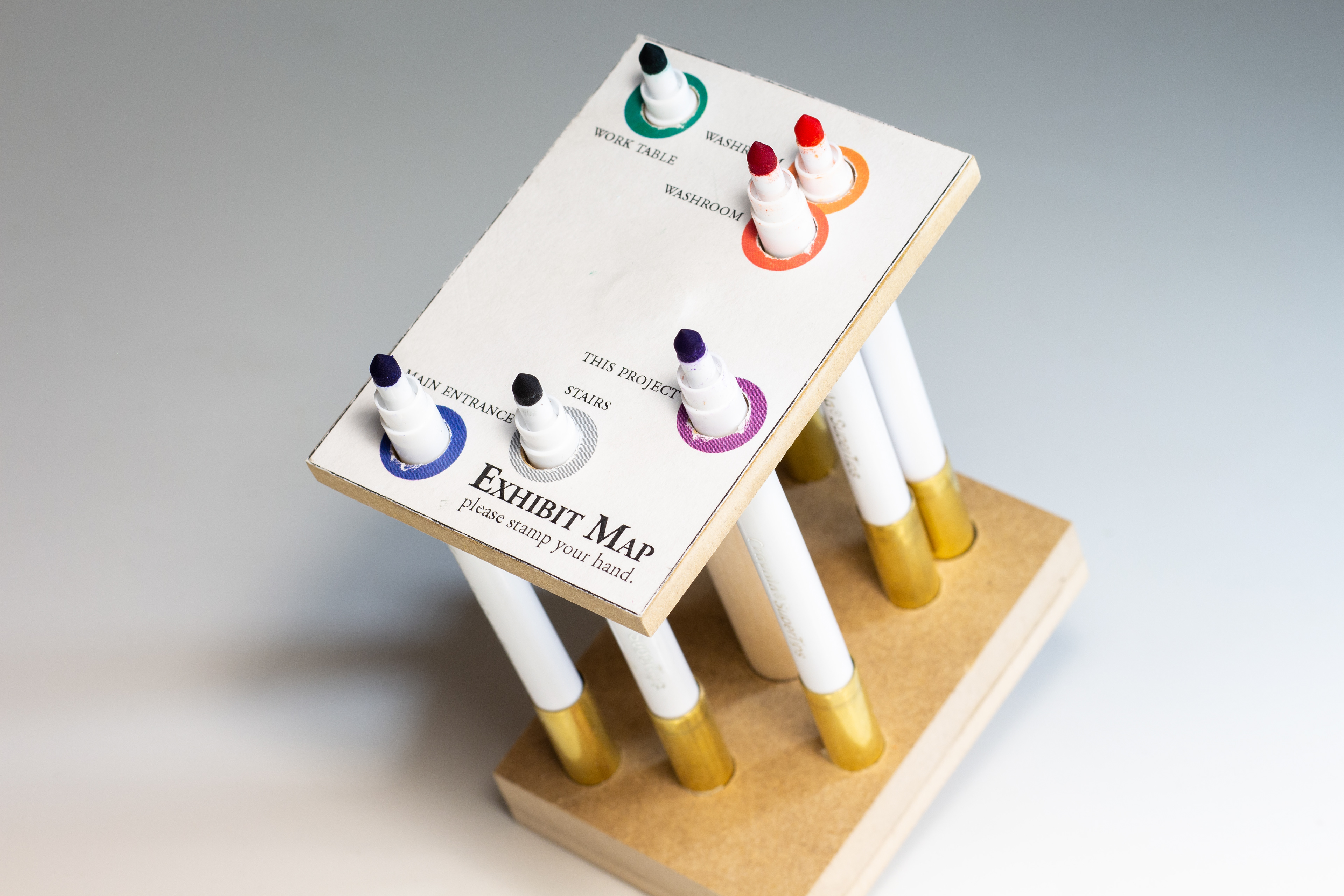
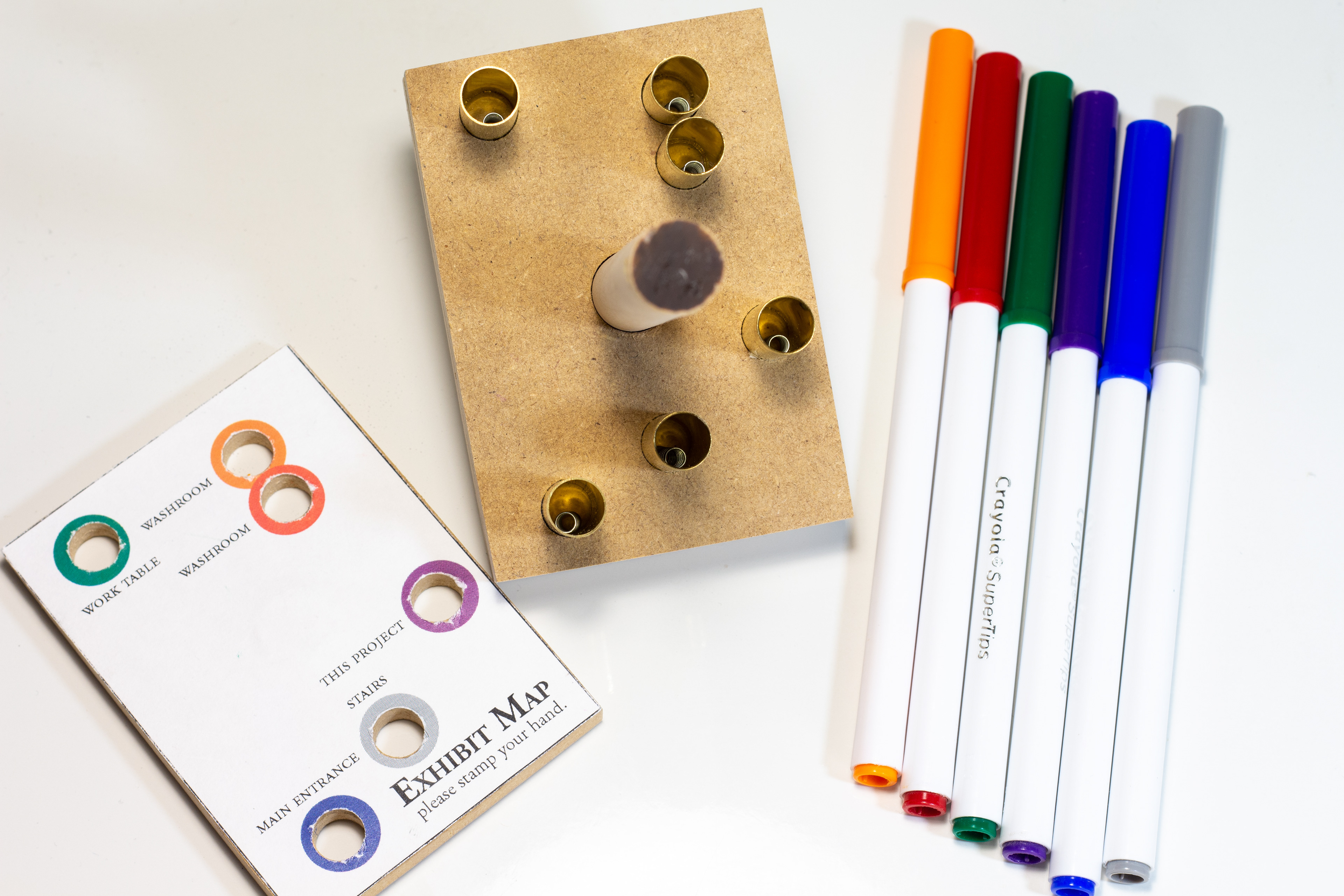
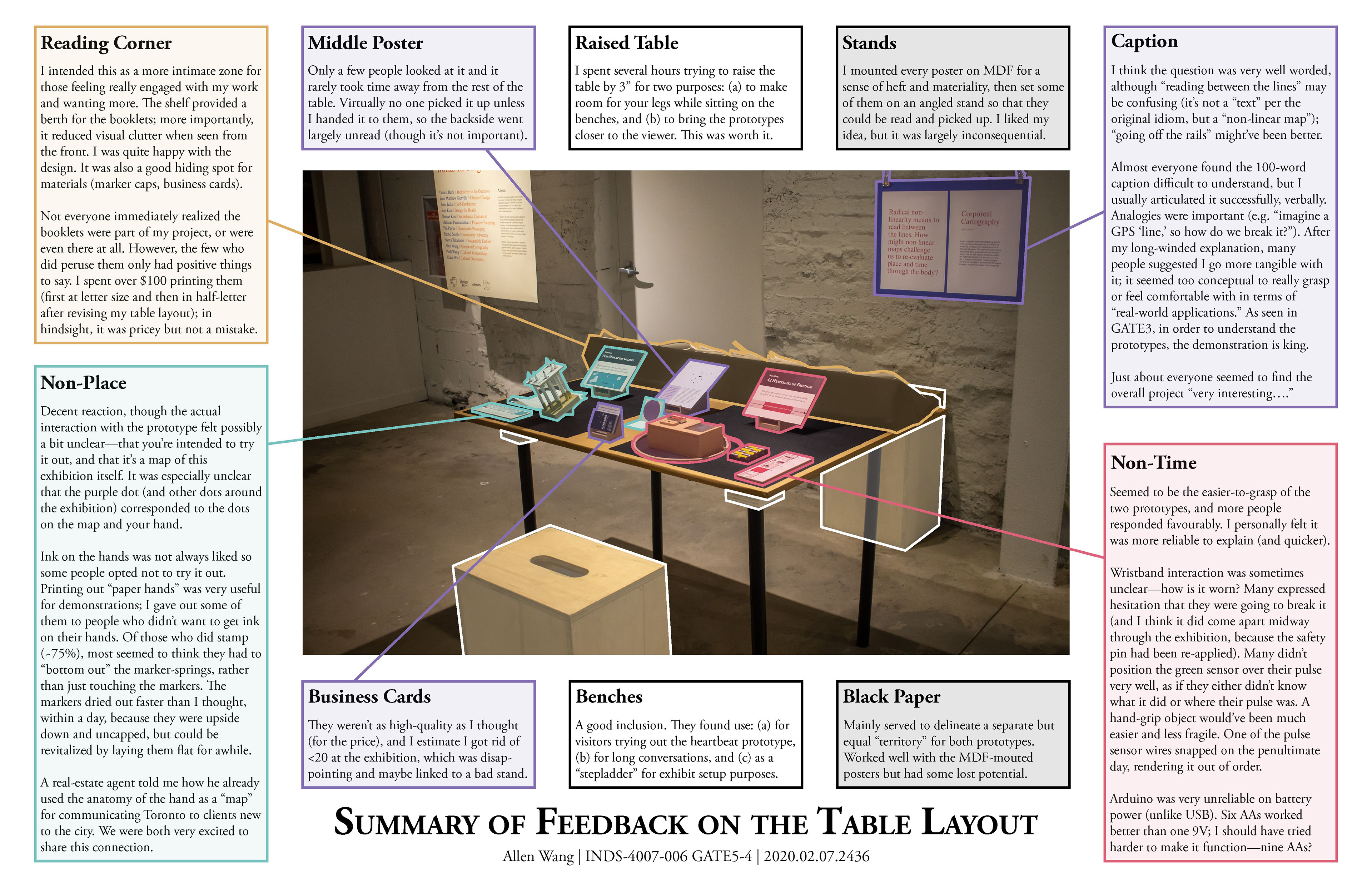
Prototype 1: Non-Place
Google Maps calculates the optimal route from Place A to Place B in the form of a rigid line—but what if I could find my own way by wandering through the interstitial space without being lost? The dots on these “maps” tell me where things in the exhibition are situated with reference to each other, but not how to get to them. By using my body as a frame of reference for (non-)place, to know it “like the back of my hand,” I shake off the structure of “north” which has no intrinsic meaning to me, and learn to orient myself through non-linear instincts.

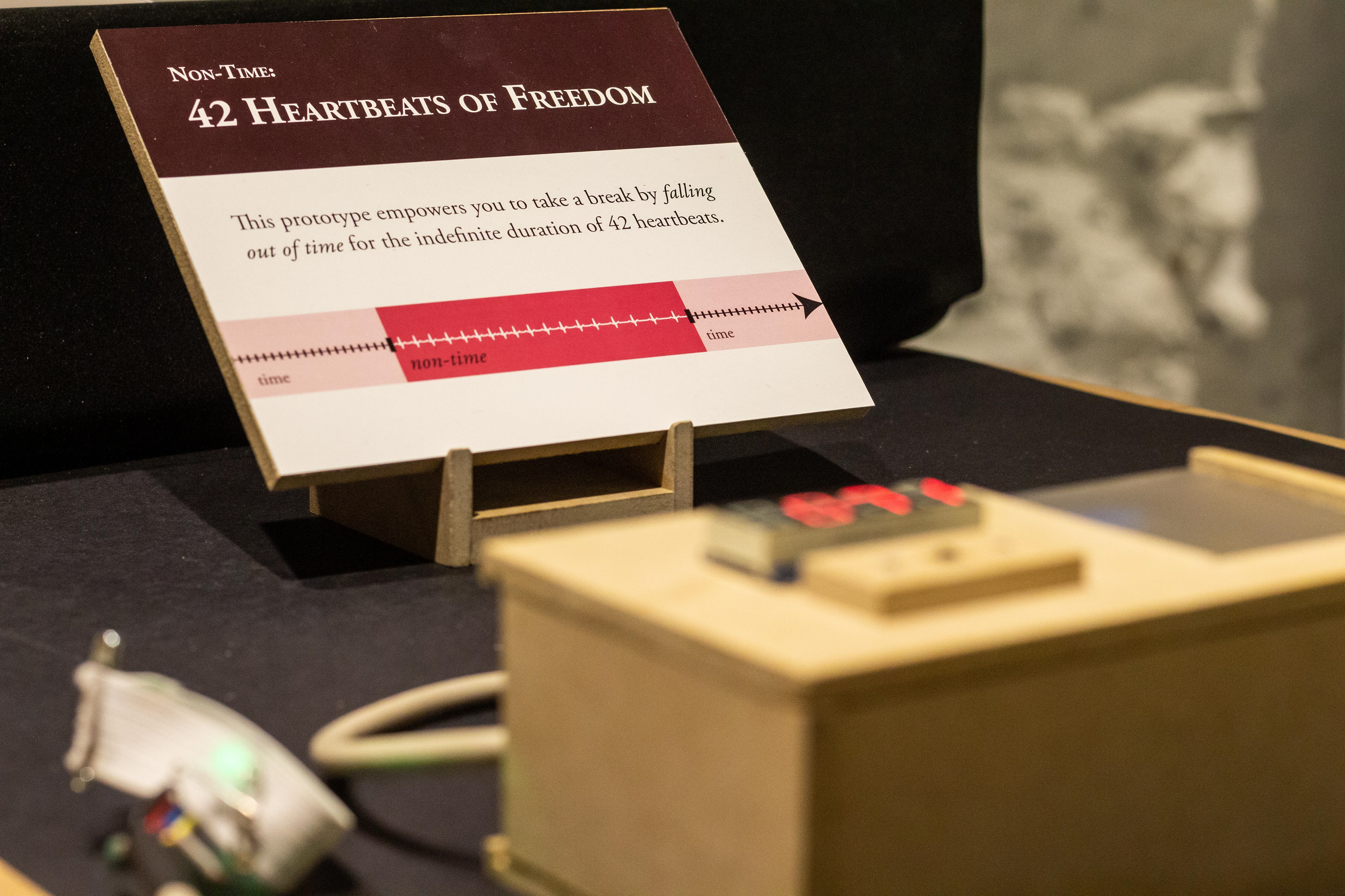
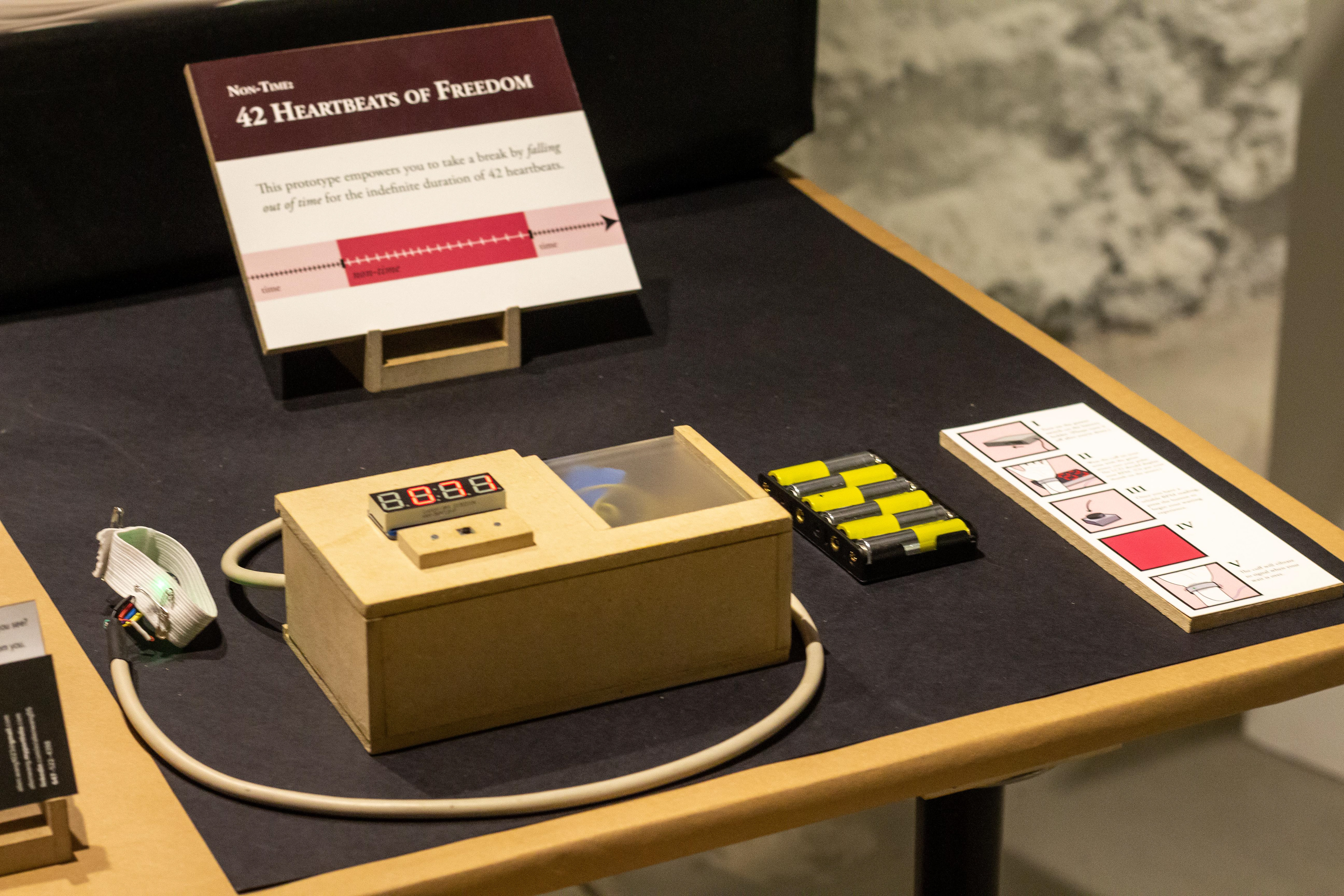
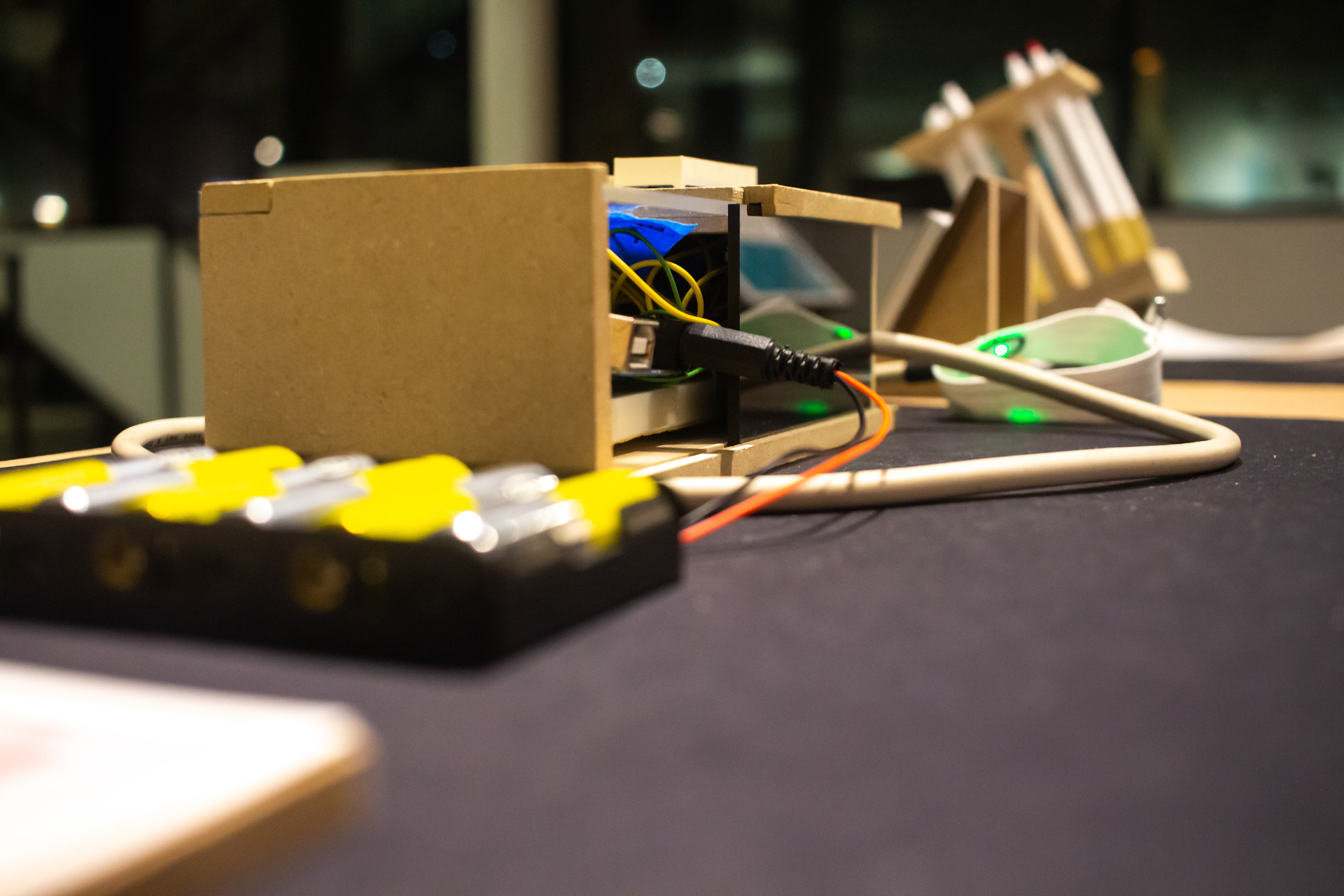
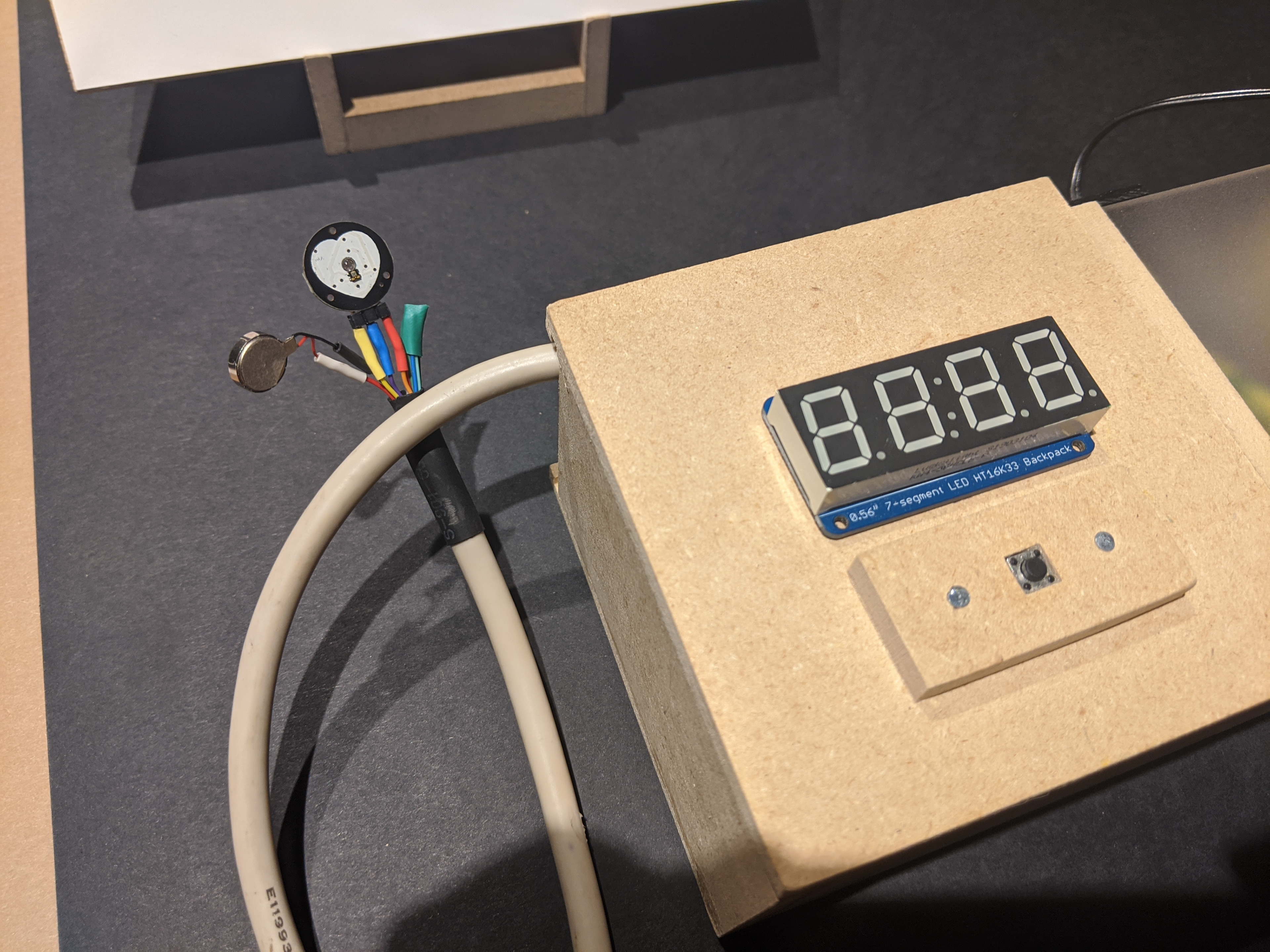
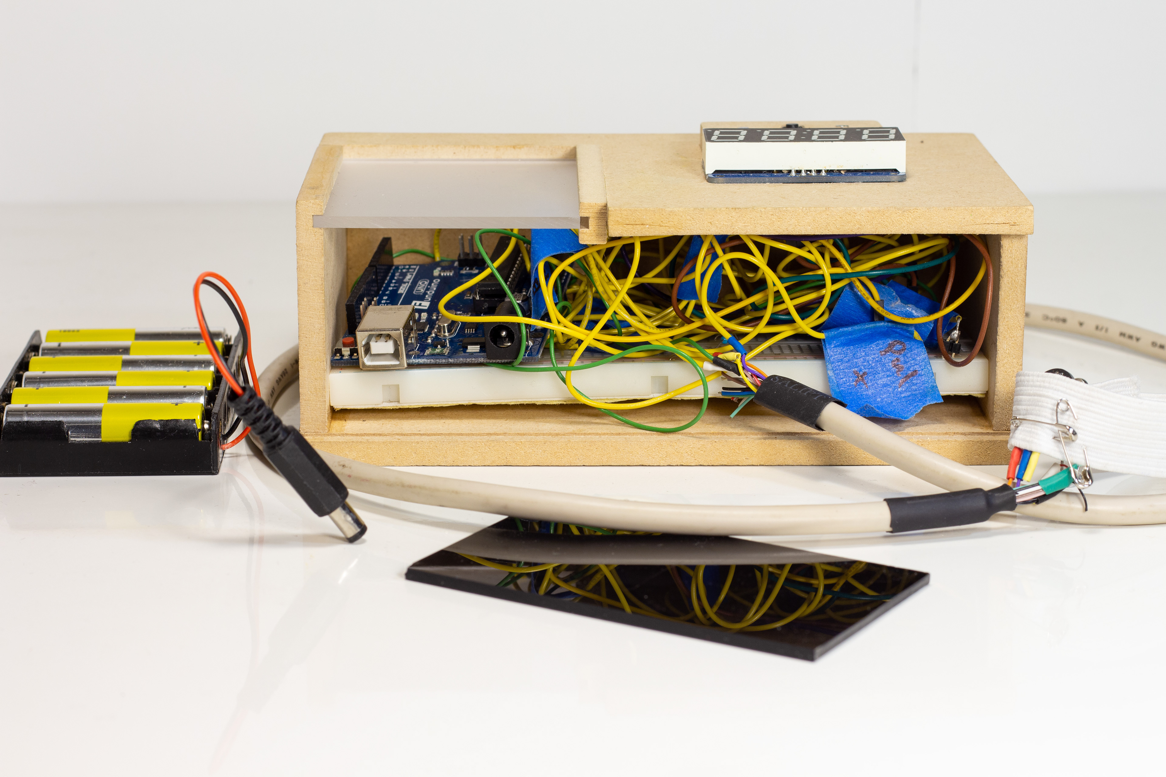
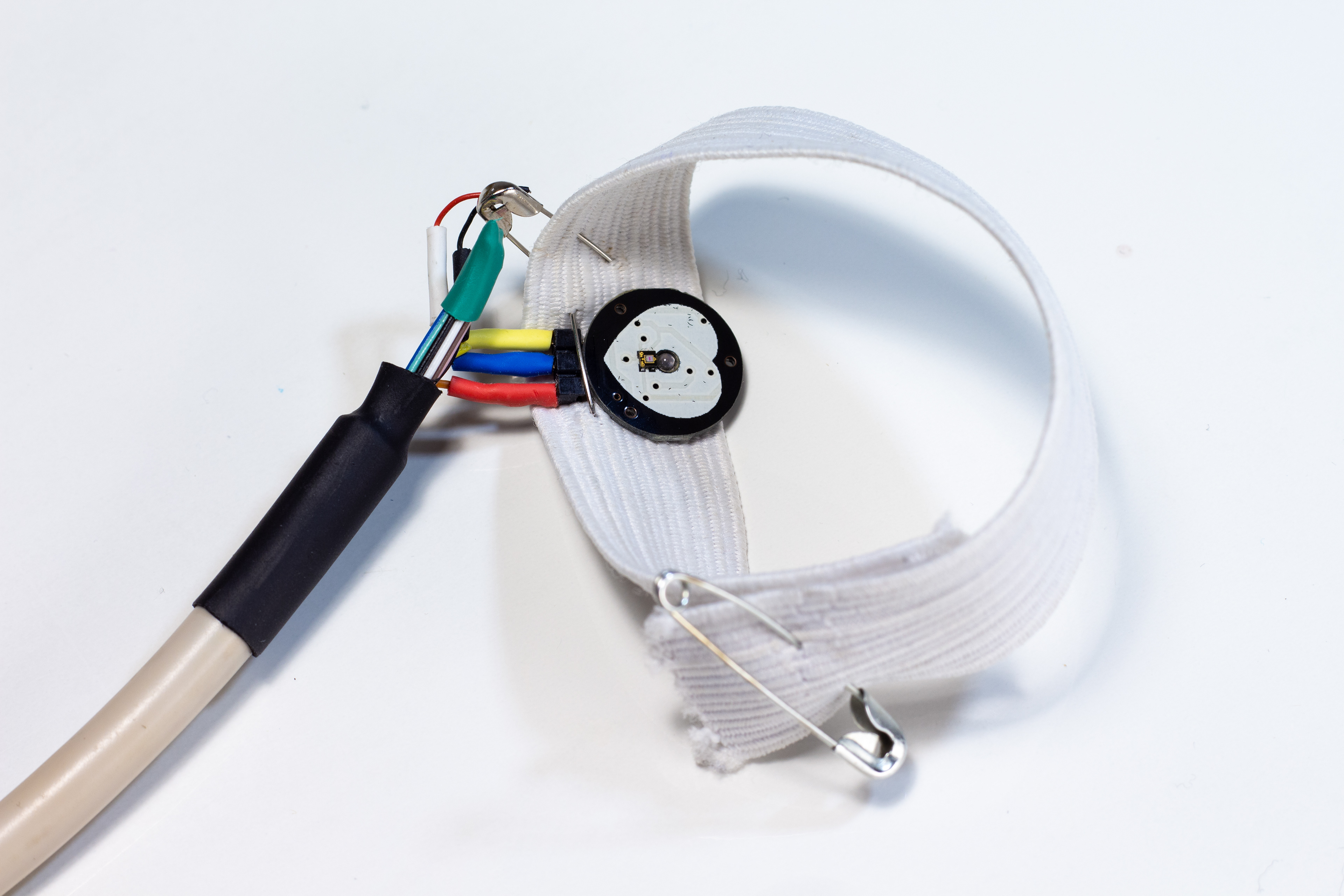
Prototype 2: Non-Time
We think of time in terms of hours, minutes, and seconds, but this is purely a social construct; I have no innate sense for measured time and must glance at a clock. Yet my body exists in its own temporal dimension: what if we counted the length of our breaks by a given number of heartbeats instead? This alternative reckoning, prototyped here with an Arduino pulse sensor, achieves a waiting experience of indefinite duration governed by my own corporeal physiology: falling out of time.

Other IMAGES


Process
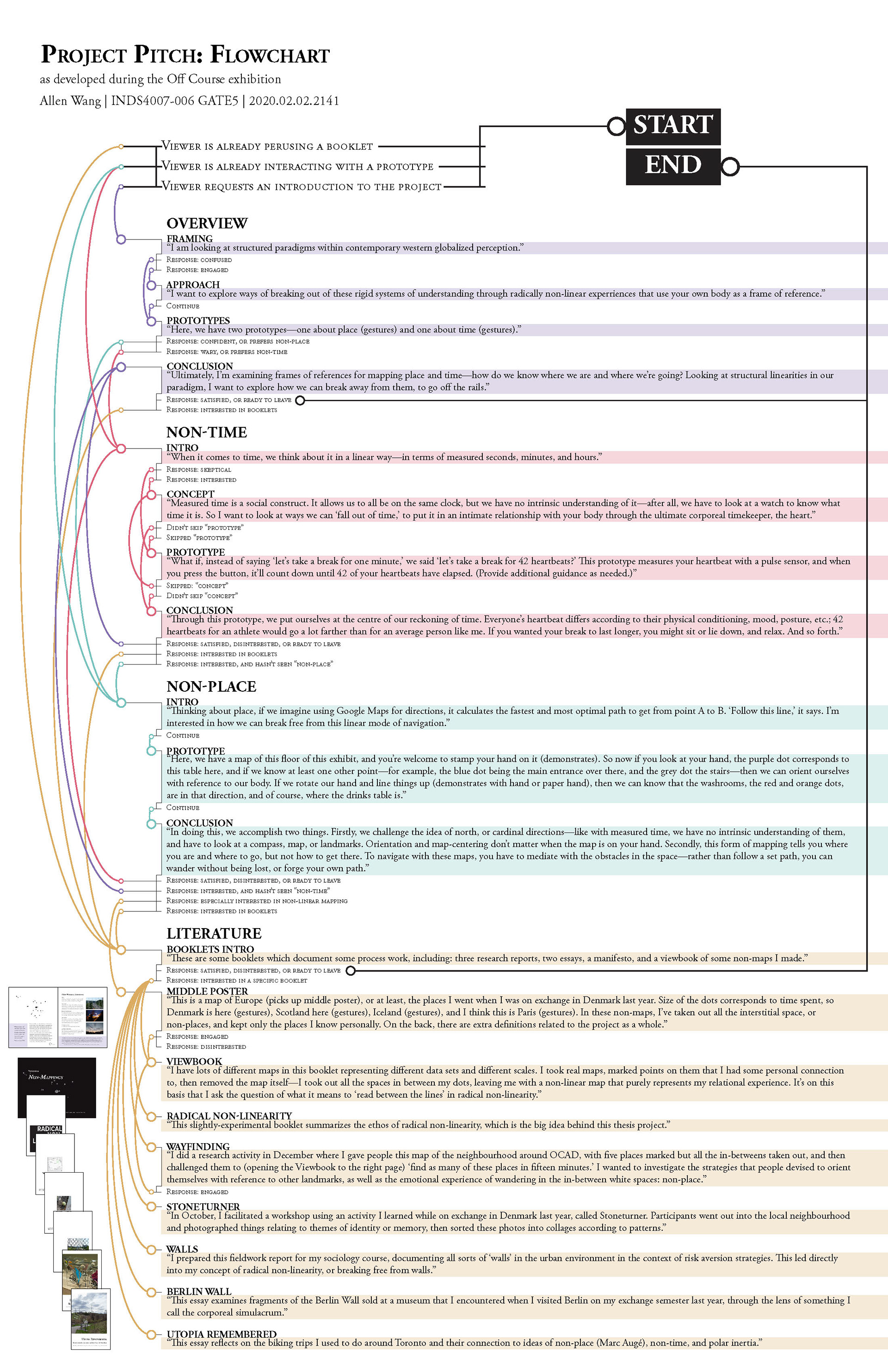
DESIGN INTENDS: COMMUNICATION
I had two main goals for the exhibition:
1: To practice articulating the conceptual side of my project and see how diverse audiences, designers and non-designers alike, responded to it. Did they understand what I was trying to accomplish? Did they relate to it? Could I even explain “radical non-linearity” in the first place?
2: To test, with fresh eyes, the interactions and shifting-of-perspectives I was exploring. I realized that my project had no better explanation than the “aha!” moment when someone tried on my prototypes for the first time. Thus, I designed everything to be interactive, from the prototypes to the booklets to the posters themselves.

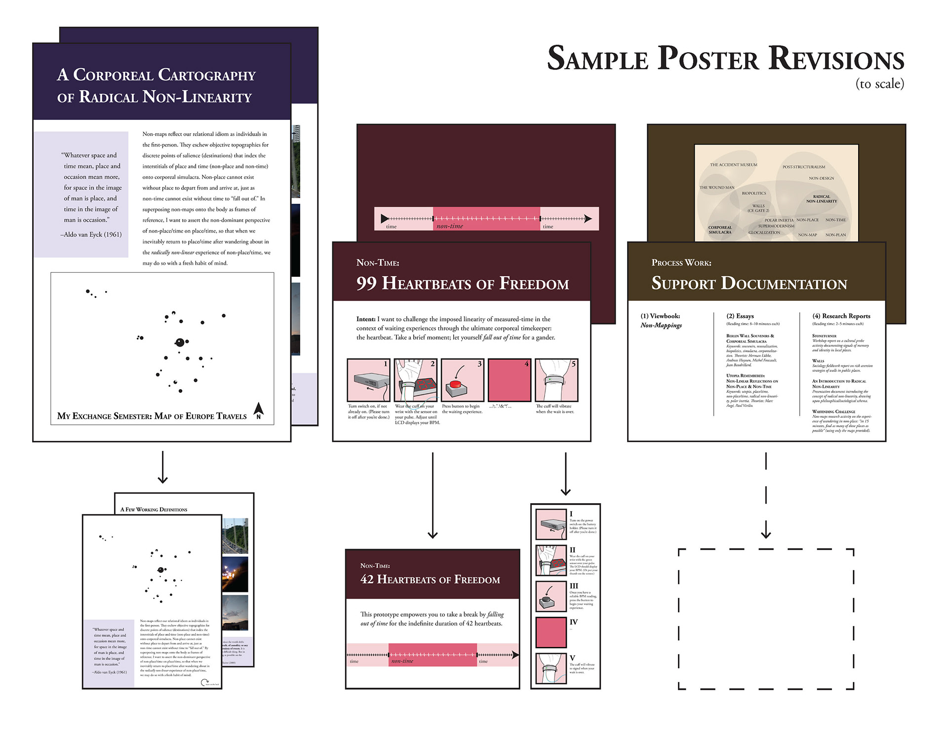
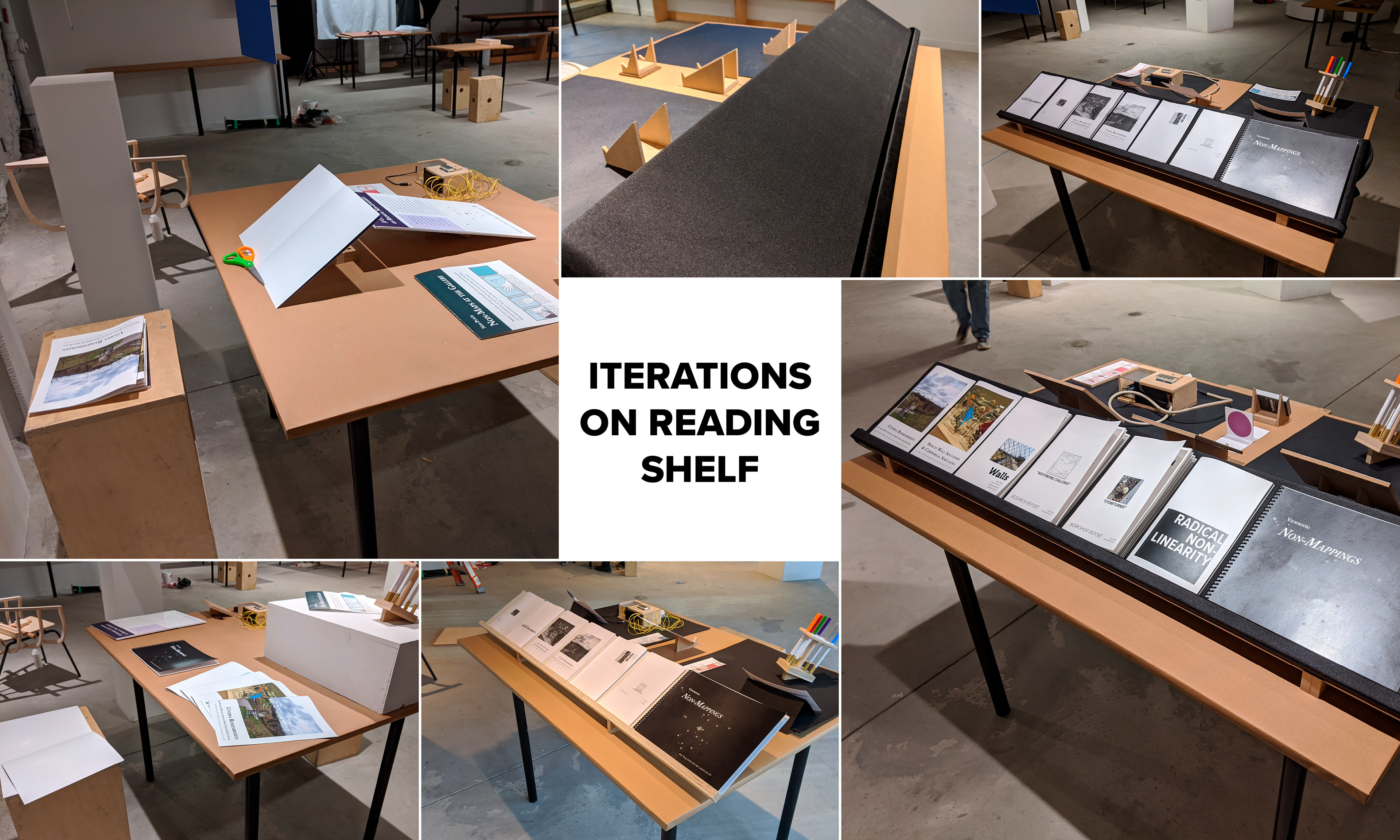
ITERATIONS: LESS IS MORE
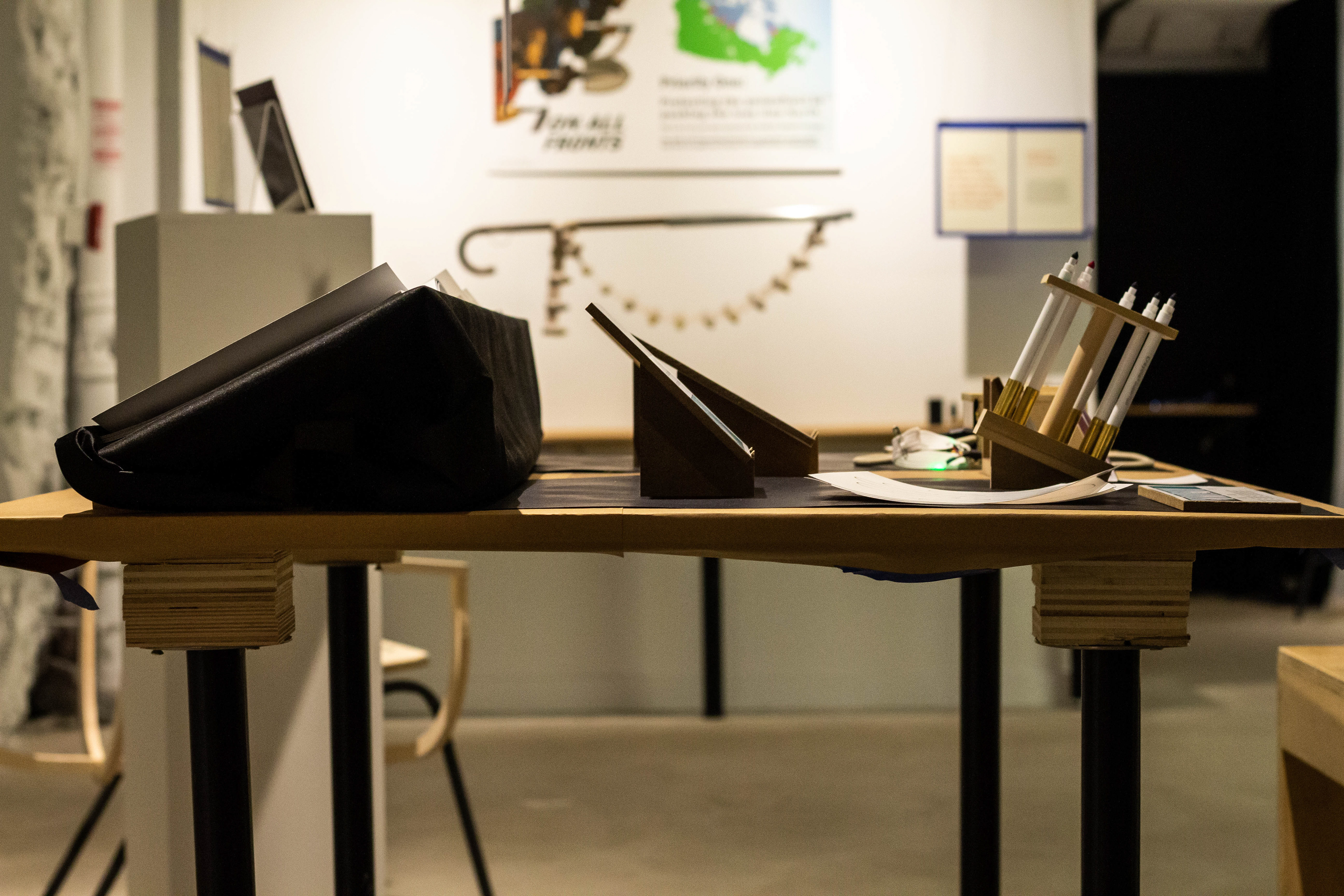
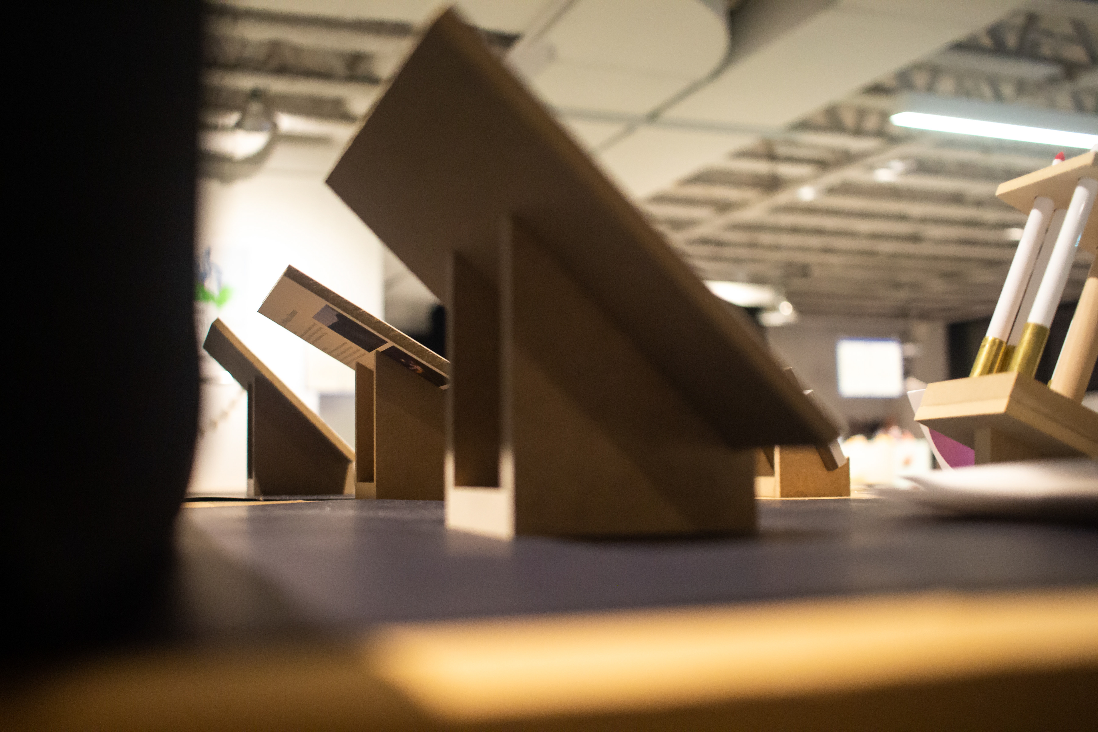
I planned a table layout with two halves: an at-a-glance frontside with interactive prototypes, and an in-depth backside with theoretical booklets for visitors curious to know more (a “quiet reading corner”). My first order of business was bringing in two stools and raising the table to create a more accommodating atmosphere. However, I’d neglected to consider non-orthographic sightlines in my initial design, leading to a highly cluttered and intimidating impression.
Under my professors’ guidance, I iterated towards a “less is more” principle, obscuring the booklets from the front-view with a shelf and downsizing my posters to make room for the prototypes to speak for themselves. To improve overall visual contrast, I added black underlays.

REFLECTION
This was my first-ever exhibition; I’d been to tons of galleries and museums during my exchange semester, but there was something magical about it being my own work on display. I really enjoyed talking about my project and connecting with real people.
Aesthetically, I was pleased with the final outcome. However, I found I still had much room for improvement in terms of communication. My verbal pitch, which I refined into algorithmic form through repetition, remained verbose and overlong. Meanwhile, visitors were more hesitant than I expected to engage with the prototypes, in part due to the time and cognitive investment required.
My fondest memory is of the reception night. For almost all of it, I was busy standing beside my project, pitching it to people passing by. I probably went through the pitch at least thirty times, and it was a long pitch too. I went slightly hoarse by the end of it, so I grabbed a beer and pitched some more.
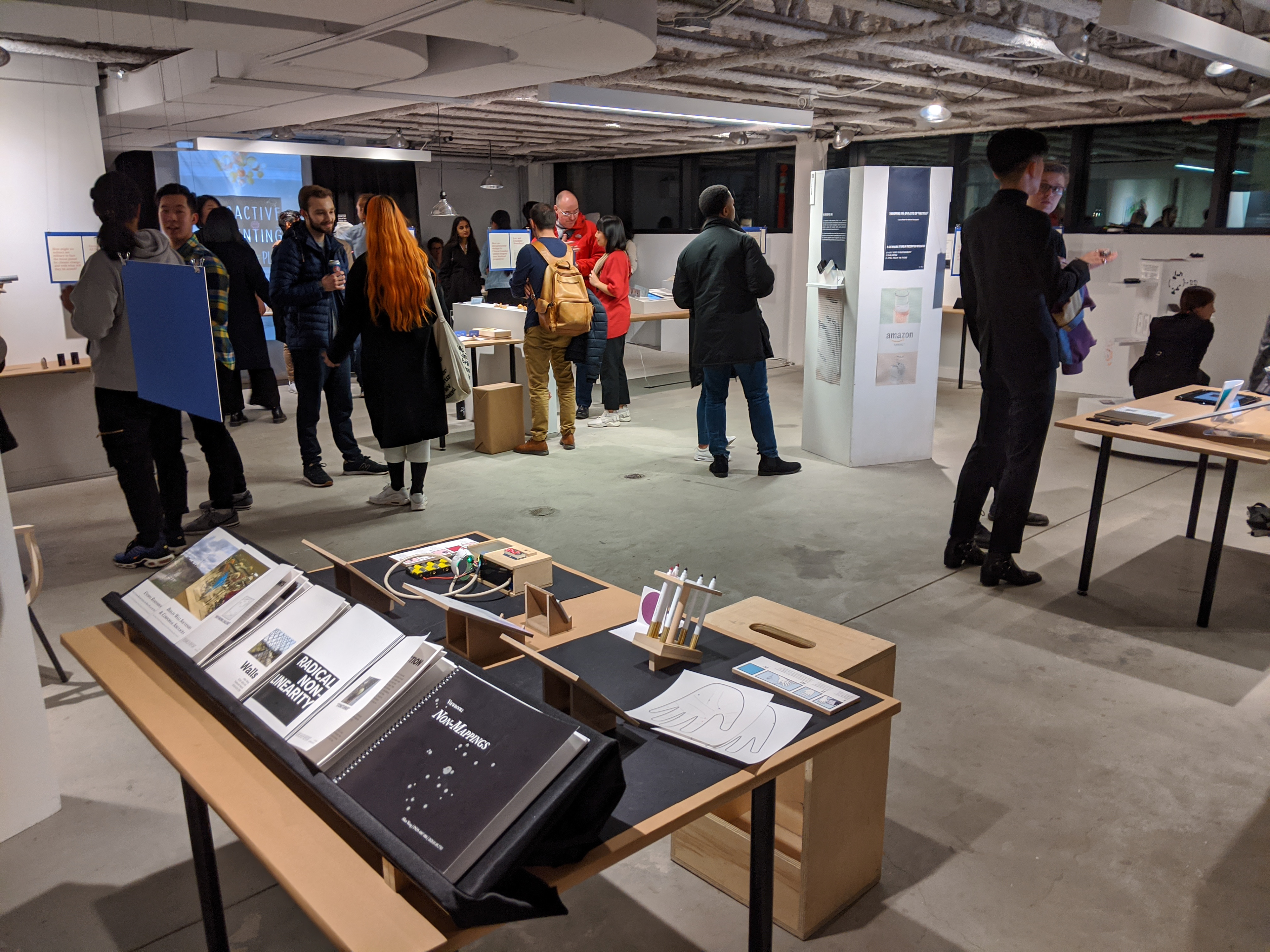
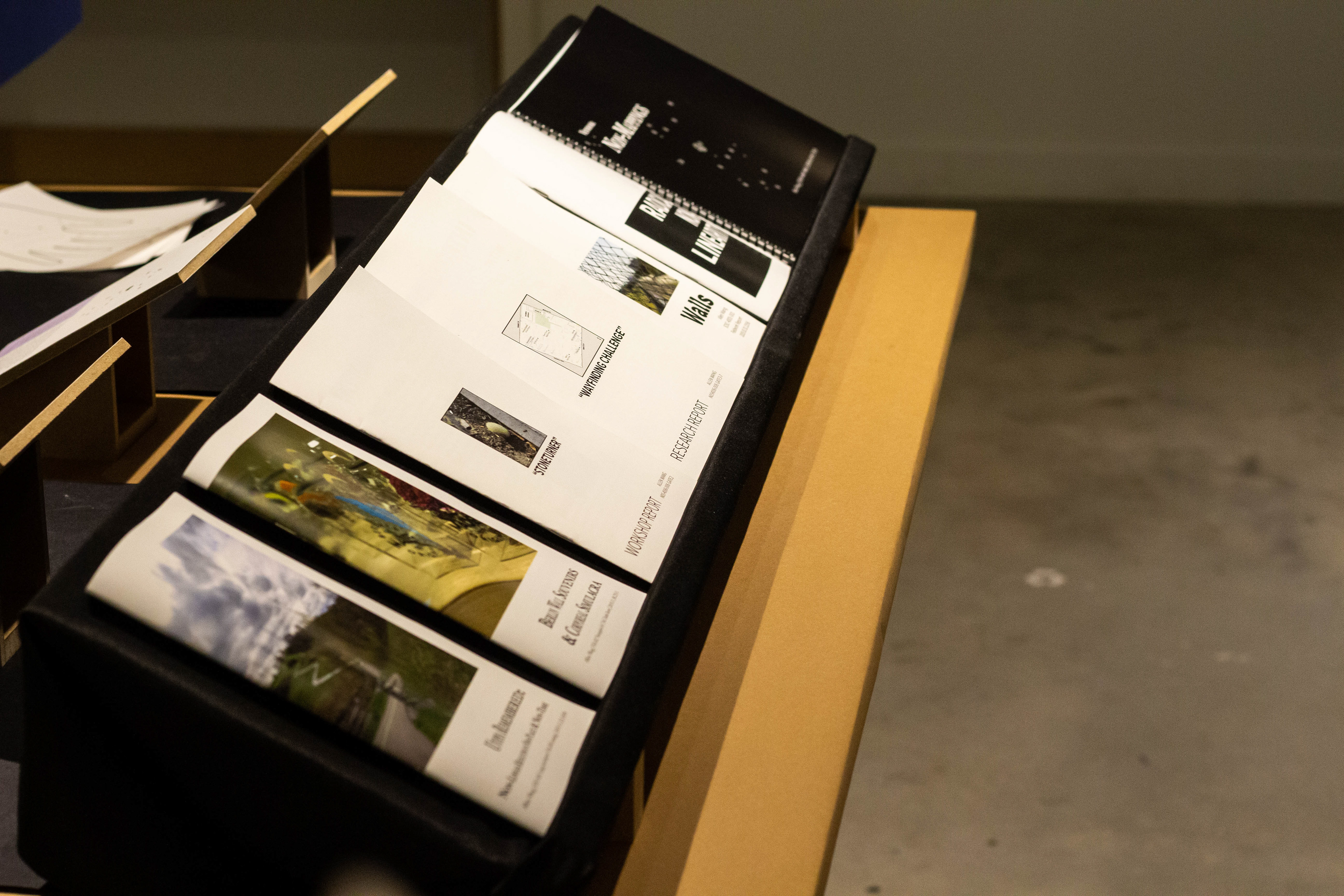
reading corner: BOOKLETS
A summary of the high-level conceptual framework behind my thesis project.
Reading time: 5–8 minutes.
An explanation and gallery of my experiments with non-linear maps.
Reading time: 5–8 minutes.
In December, I ran a research activity on user experiences wayfinding with non-maps.
Reading time: 3–5 minutes.
In October, I conducted a workshop with the Stoneturner method of cultural probing I learned in Denmark.
Reading time: 3–5 minutes.
In October, I documented walls and analyzed risk aversion strategies around them.
Reading time: 5–8 minutes.
A sentimental essay on my biking adventures contextualized with Marc Augé's "non-place" and Paul Virilio's "polar inertia."
Reading time: 8–10 minutes.
An analysis of souvenir-fragments I encountered in Berlin in July 2019, through the lens of what I refer to as the "corporeal simulacrum."
Reading time: 8–10 minutes.
